class: center, middle, inverse, title-slide # Storytelling with Data Visualization ## Autodesk - technical meeting ### <span style='color:yellow'>Anabelle Laurent ### November 30, 2021 --- ### Why is Data Visualization important? 📊 --- ### Why is Data Visualization important? 📊 - **Universal way** to communicate information - Provides clear and **effective message** - Find **patterns, trends, spot extreme values** - Make data **memorable** - Maintain the audience's interest --- ### What make a good visualization? 🤔 --- ### What make a good visualization? 🤔 - Reveals a **trend** or **relationship** between variables - Always have at minimum a **caption**, **axis**, **scales** and **symbols** - Distinct and legible symbols (i.e., use contrast) - Caption should convey as much information as possible - No noise: keep information at minimum - the **correct graph type** based on the kind of data to be presented --- ### Disclaimer This workshop does not provide code but all the plots were made using R Studio (see last slides for more details) <center><img src="images/ggplot2_masterpiece.png" style="width: 70%" /> </center> [Artwork by @allison_horst](https://github.com/allisonhorst/stats-illustrations) --- # Visualizing distribution <center><img src="images/histogram.png" style="width: 70%" /> </center> [Artwork by @allison_horst](https://github.com/allisonhorst/stats-illustrations) --- ### Visualizing distribution : histograms .right-column[ 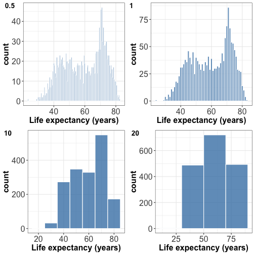<!-- --> ] .left-column[ For plotting the distribution of a single quantitative variable Try different bin widths for best visual appearance. - Small bin width -> peaky and busy histogram - Large bin width -> features might disappear ] --- ### Visualizing distribution : density plot .right-column[ 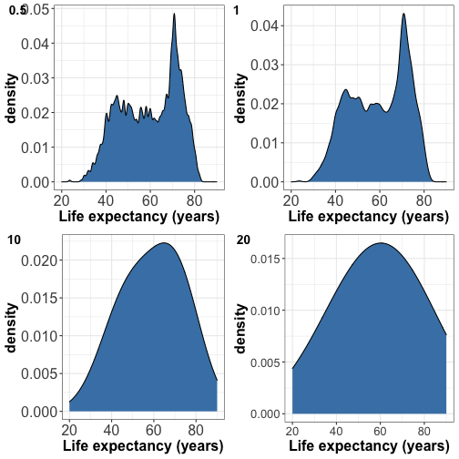<!-- --> ] .left-column[ Try different bandwidths for best visual appearance - Small bandwidth -> peaky and busy density - Large bandwidth -> smooth feature and might look like a gaussian ] --- ### Visualizing multiple distributions 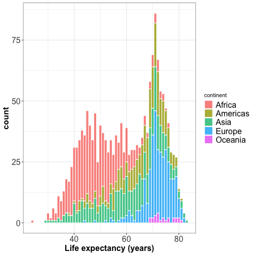<!-- --> --- ### Visualizing multiple distributions .right-column[ 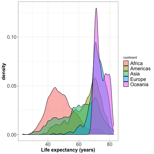<!-- --> ] .left-column[ - The peaks of the density plot are where there is the highest concentration of points - For several distributions, density plots work better than histograms. ] --- ### Visualizing multiple distributions <!-- --> --- ### Visualizing multiple distributions: ridgeline plot <!-- --> --- ### Visualizing multiple distributions: ridgeline plot .right-column[ 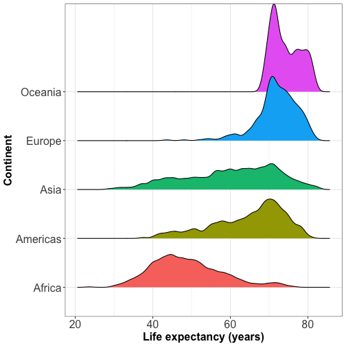<!-- --> ] .left-column[ Ridgeline plot shows the distribution of a numeric value for several groups (at least 5-6 groups) or when they overlap each other. ] --- ### Visualizing distributions: boxplot <center><img src="images/read_boxplot.jpeg" style="width: 100%" /> </center> A boxplot can summarize the distribution of a numeric variable for several groups --- ### Visualizing distributions: boxplot .right-column[ 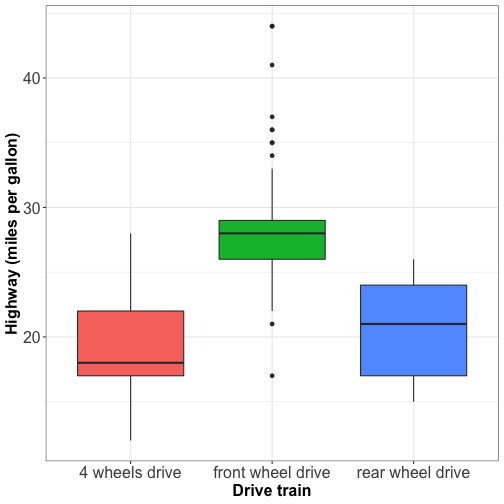<!-- --> ] .left-column[ Boxplot does not tell about the number of observations. ] --- ### Visualizing distributions: boxplot with jitter .right-column[ 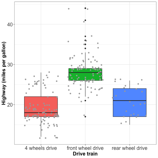<!-- --> ] .left-column[ Boxplots with jitter tell about: - the distribution of the data - if the groups are balanced or unbalanced in terms of observations. ] --- ### Visualizing distributions: boxplot with jitter .right-column[ 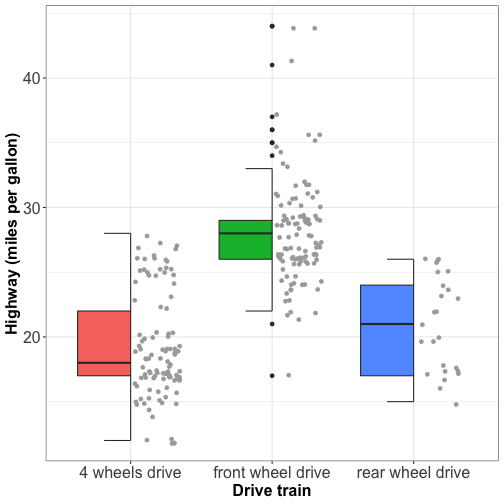<!-- --> ] .left-column[ No overlapping facilitates the visual appearence of the plot ] --- ### Visualizing distributions: violin plot .right-column[ 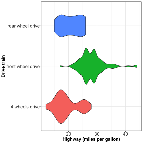<!-- --> ] .left-column[ - Violins are equivalent to density estimate - They are useful to represent bimodal data. ] --- # Visualizing associations among quantitative variables --- ### Relationship between 2 numeric variables: scatterplot 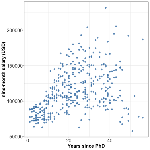<!-- --> --- ### Relationship between 2 numeric variables: scatterplot + linear fit 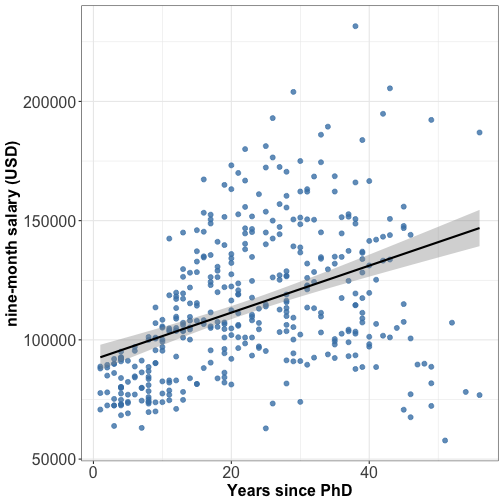<!-- --> --- ##### Relationship between 2 numeric variables: scatterplot + quadratic fit 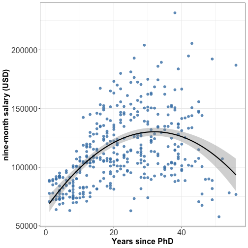<!-- --> ⚠️ Linear fit is widely used but it is not always the best fit, try quadratic fit too. --- ### Relationship between 2 numeric variables: scatterplot 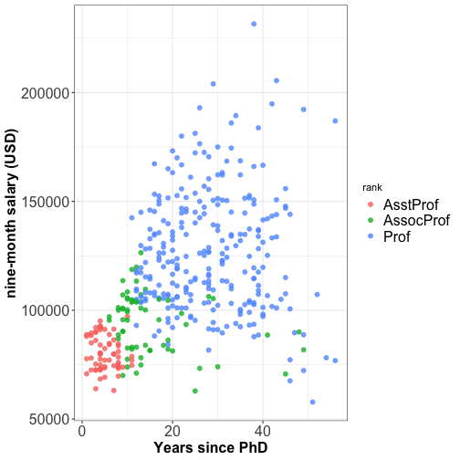<!-- --> --- ### Multi-panel plots <!-- --> Split a single plot using one variable with many levels --- ### Multi-panel plots 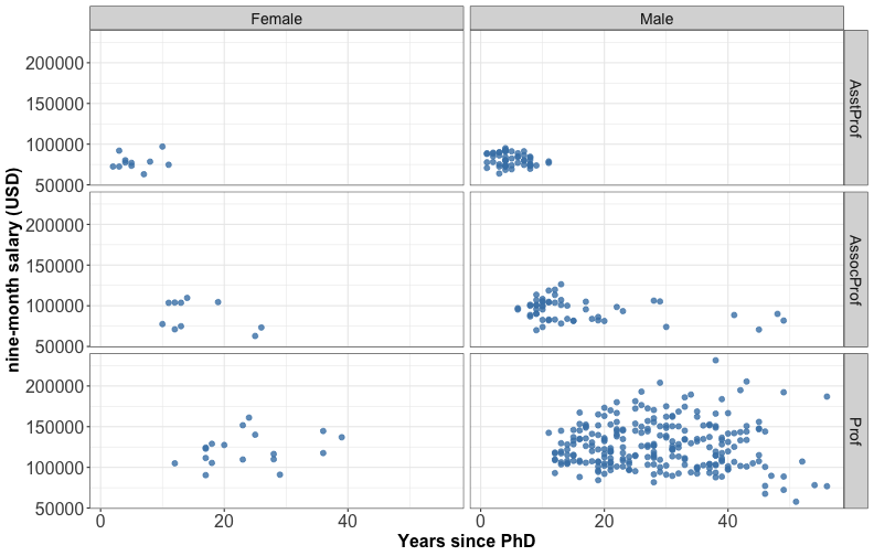<!-- --> Split a single plot using the combinations of two discrete variables. --- ### Multi-panel plots 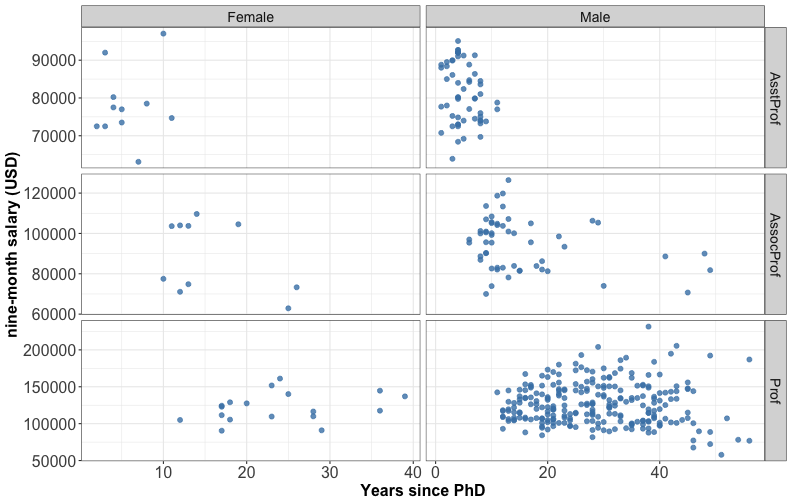<!-- --> ⚠️ different scales can lead to misinterpretation --- ### Bubble plot A bubble plot is a scatterplot with 3 numerical variables 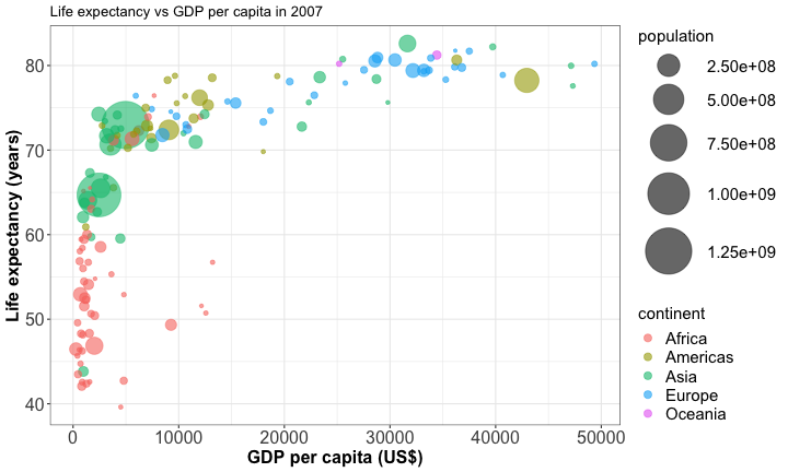<!-- --> --- # Tell a story with your data 📖 --- ### Tell a story with your data Before data visualization you must: - Know your audience - Know the level of data detail expected - Give enough context - Ask yourself: What do I want my audience know/remember with the data I am presenting? --- ### Tell a story with your data .right-column[ <center><img src="images/2020_08_14_penguins.png" style="width: 80%" /> </center> ] .left-column[ Don't be repetitive but be consistent (theme, color scheme, font size etc.) ] --- ### Tell a story with your data Guide your audience by point out specific values <center><img src="images/2019_10_08_powerlifting.png" style="width: 80%" /> </center> --- ### Tell a story with your data Guide your audience by pointing out specific values <center><img src="images/2020_foodconsumption.png" style="width: 70%" /> </center> --- ### Tell a story with your data Customize your plot using highlighting 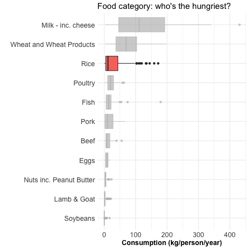<!-- --> --- ### Tell a story with your data Customize your plot using highlighting + text 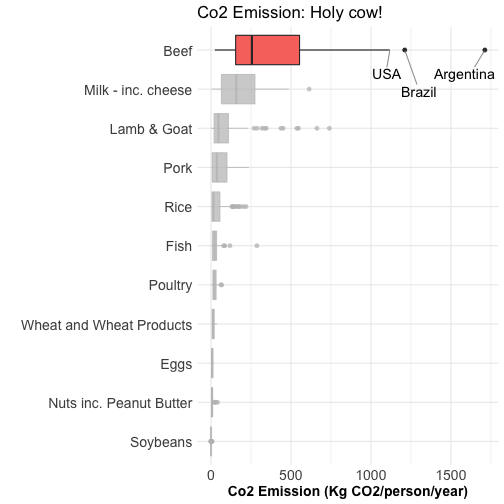<!-- --> --- ### Interactive graphics with ggplotly <div id="htmlwidget-86e6d17955cb99a5c992" style="width:720px;height:504px;" class="plotly html-widget"></div> <script type="application/json" data-for="htmlwidget-86e6d17955cb99a5c992">{"x":{"data":[{"x":[2014,5581,691,278,9270,2602,1107,1463,3820,6223,1056,1328,824,1045,1545,2042,1217,759,620,4797,470,1712,1043,1271,7093,1704,943,926,863,430,1441,863,12057,883,641,706,3633,1803,415,4811,1569,753,12570,579,13206,10957,4513,7670,986,12154,2082,1598],"y":[46.9,71.3,52.9,46.5,49.3,58.6,52.5,54.1,71.2,72.3,51.5,60,42.1,59.4,48.3,50.4,52.3,48.3,56.9,42.7,43.5,63.1,54.5,42.4,73.9,50.7,56,48.2,46.2,49.6,56.7,42.6,74,58.4,58,44.7,55.3,64.2,45.7,52.9,42.6,59.4,50.7,46.4,56.7,72.8,39.6,76.4,65.2,51.6,54.8,65.5],"text":["Country: Nigeria<br />Population (M): 135.03<br />Life Expectancy: 46.9<br />Gdp per capita: 2014","Country: Egypt<br />Population (M): 80.26<br />Life Expectancy: 71.3<br />Gdp per capita: 5581","Country: Ethiopia<br />Population (M): 76.51<br />Life Expectancy: 52.9<br />Gdp per capita: 691","Country: Congo, Dem. Rep.<br />Population (M): 64.61<br />Life Expectancy: 46.5<br />Gdp per capita: 278","Country: South Africa<br />Population (M): 44<br />Life Expectancy: 49.3<br />Gdp per capita: 9270","Country: Sudan<br />Population (M): 42.29<br />Life Expectancy: 58.6<br />Gdp per capita: 2602","Country: Tanzania<br />Population (M): 38.14<br />Life Expectancy: 52.5<br />Gdp per capita: 1107","Country: Kenya<br />Population (M): 35.61<br />Life Expectancy: 54.1<br />Gdp per capita: 1463","Country: Morocco<br />Population (M): 33.76<br />Life Expectancy: 71.2<br />Gdp per capita: 3820","Country: Algeria<br />Population (M): 33.33<br />Life Expectancy: 72.3<br />Gdp per capita: 6223","Country: Uganda<br />Population (M): 29.17<br />Life Expectancy: 51.5<br />Gdp per capita: 1056","Country: Ghana<br />Population (M): 22.87<br />Life Expectancy: 60<br />Gdp per capita: 1328","Country: Mozambique<br />Population (M): 19.95<br />Life Expectancy: 42.1<br />Gdp per capita: 824","Country: Madagascar<br />Population (M): 19.17<br />Life Expectancy: 59.4<br />Gdp per capita: 1045","Country: Cote d'Ivoire<br />Population (M): 18.01<br />Life Expectancy: 48.3<br />Gdp per capita: 1545","Country: Cameroon<br />Population (M): 17.7<br />Life Expectancy: 50.4<br />Gdp per capita: 2042","Country: Burkina Faso<br />Population (M): 14.33<br />Life Expectancy: 52.3<br />Gdp per capita: 1217","Country: Malawi<br />Population (M): 13.33<br />Life Expectancy: 48.3<br />Gdp per capita: 759","Country: Niger<br />Population (M): 12.89<br />Life Expectancy: 56.9<br />Gdp per capita: 620","Country: Angola<br />Population (M): 12.42<br />Life Expectancy: 42.7<br />Gdp per capita: 4797","Country: Zimbabwe<br />Population (M): 12.31<br />Life Expectancy: 43.5<br />Gdp per capita: 470","Country: Senegal<br />Population (M): 12.27<br />Life Expectancy: 63.1<br />Gdp per capita: 1712","Country: Mali<br />Population (M): 12.03<br />Life Expectancy: 54.5<br />Gdp per capita: 1043","Country: Zambia<br />Population (M): 11.75<br />Life Expectancy: 42.4<br />Gdp per capita: 1271","Country: Tunisia<br />Population (M): 10.28<br />Life Expectancy: 73.9<br />Gdp per capita: 7093","Country: Chad<br />Population (M): 10.24<br />Life Expectancy: 50.7<br />Gdp per capita: 1704","Country: Guinea<br />Population (M): 9.95<br />Life Expectancy: 56<br />Gdp per capita: 943","Country: Somalia<br />Population (M): 9.12<br />Life Expectancy: 48.2<br />Gdp per capita: 926","Country: Rwanda<br />Population (M): 8.86<br />Life Expectancy: 46.2<br />Gdp per capita: 863","Country: Burundi<br />Population (M): 8.39<br />Life Expectancy: 49.6<br />Gdp per capita: 430","Country: Benin<br />Population (M): 8.08<br />Life Expectancy: 56.7<br />Gdp per capita: 1441","Country: Sierra Leone<br />Population (M): 6.14<br />Life Expectancy: 42.6<br />Gdp per capita: 863","Country: Libya<br />Population (M): 6.04<br />Life Expectancy: 74<br />Gdp per capita: 12057","Country: Togo<br />Population (M): 5.7<br />Life Expectancy: 58.4<br />Gdp per capita: 883","Country: Eritrea<br />Population (M): 4.91<br />Life Expectancy: 58<br />Gdp per capita: 641","Country: Central African Republic<br />Population (M): 4.37<br />Life Expectancy: 44.7<br />Gdp per capita: 706","Country: Congo, Rep.<br />Population (M): 3.8<br />Life Expectancy: 55.3<br />Gdp per capita: 3633","Country: Mauritania<br />Population (M): 3.27<br />Life Expectancy: 64.2<br />Gdp per capita: 1803","Country: Liberia<br />Population (M): 3.19<br />Life Expectancy: 45.7<br />Gdp per capita: 415","Country: Namibia<br />Population (M): 2.06<br />Life Expectancy: 52.9<br />Gdp per capita: 4811","Country: Lesotho<br />Population (M): 2.01<br />Life Expectancy: 42.6<br />Gdp per capita: 1569","Country: Gambia<br />Population (M): 1.69<br />Life Expectancy: 59.4<br />Gdp per capita: 753","Country: Botswana<br />Population (M): 1.64<br />Life Expectancy: 50.7<br />Gdp per capita: 12570","Country: Guinea-Bissau<br />Population (M): 1.47<br />Life Expectancy: 46.4<br />Gdp per capita: 579","Country: Gabon<br />Population (M): 1.45<br />Life Expectancy: 56.7<br />Gdp per capita: 13206","Country: Mauritius<br />Population (M): 1.25<br />Life Expectancy: 72.8<br />Gdp per capita: 10957","Country: Swaziland<br />Population (M): 1.13<br />Life Expectancy: 39.6<br />Gdp per capita: 4513","Country: Reunion<br />Population (M): 0.8<br />Life Expectancy: 76.4<br />Gdp per capita: 7670","Country: Comoros<br />Population (M): 0.71<br />Life Expectancy: 65.2<br />Gdp per capita: 986","Country: Equatorial Guinea<br />Population (M): 0.55<br />Life Expectancy: 51.6<br />Gdp per capita: 12154","Country: Djibouti<br />Population (M): 0.5<br />Life Expectancy: 54.8<br />Gdp per capita: 2082","Country: Sao Tome and Principe<br />Population (M): 0.2<br />Life Expectancy: 65.5<br />Gdp per capita: 1598"],"type":"scatter","mode":"markers","marker":{"autocolorscale":false,"color":"rgba(248,118,109,1)","opacity":0.6,"size":[14.6572136042599,12.1615929690515,11.9629313216902,11.2978319047865,9.9793650775161,9.85713598565924,9.54974150337008,9.35403136171842,9.20645767078819,9.17157830266448,8.82169774677938,8.23987831859504,7.94272303221921,7.8596849679774,7.7329681085029,7.6984103731599,7.30091923748479,7.17402601698297,7.11666477067488,7.05428287362732,7.03951047578867,7.03412207059,7.00160240877907,6.96324300756063,6.75375049726184,6.74784339522779,6.70466017611406,6.57738562954218,6.53630812592281,6.46045588614649,6.40922849788235,6.06268823187532,6.04338813354041,5.97649994081497,5.8126039925186,5.69251130582439,5.55696573219675,5.42092004294199,5.3993926523259,5.05714174338186,5.03985252722441,4.92302813288024,4.90367816450638,4.83523872054285,4.82689304686202,4.73945388468701,4.68293721253268,4.5051636546454,4.44853098336622,4.3337412815609,4.29262976292074,3.77952755905512],"symbol":"circle","line":{"width":1.88976377952756,"color":"rgba(248,118,109,1)"}},"hoveron":"points","name":"Africa","legendgroup":"Africa","showlegend":true,"xaxis":"x","yaxis":"y","hoverinfo":"text","frame":null},{"x":[42952,9066,11978,7007,12779,36319,7409,11416,13172,6873,5186,8948,6025,3822,1202,3548,5728,4173,2749,9645,19329,10611,9809,7321,18009],"y":[78.2,72.4,76.2,72.9,75.3,80.7,71.4,73.7,78.6,75,70.3,78.3,72.2,65.6,60.9,70.2,71.9,71.8,72.9,78.8,78.7,76.4,75.5,72.6,69.8],"text":["Country: United States<br />Population (M): 301.14<br />Life Expectancy: 78.2<br />Gdp per capita: 42952","Country: Brazil<br />Population (M): 190.01<br />Life Expectancy: 72.4<br />Gdp per capita: 9066","Country: Mexico<br />Population (M): 108.7<br />Life Expectancy: 76.2<br />Gdp per capita: 11978","Country: Colombia<br />Population (M): 44.23<br />Life Expectancy: 72.9<br />Gdp per capita: 7007","Country: Argentina<br />Population (M): 40.3<br />Life Expectancy: 75.3<br />Gdp per capita: 12779","Country: Canada<br />Population (M): 33.39<br />Life Expectancy: 80.7<br />Gdp per capita: 36319","Country: Peru<br />Population (M): 28.67<br />Life Expectancy: 71.4<br />Gdp per capita: 7409","Country: Venezuela<br />Population (M): 26.08<br />Life Expectancy: 73.7<br />Gdp per capita: 11416","Country: Chile<br />Population (M): 16.28<br />Life Expectancy: 78.6<br />Gdp per capita: 13172","Country: Ecuador<br />Population (M): 13.76<br />Life Expectancy: 75<br />Gdp per capita: 6873","Country: Guatemala<br />Population (M): 12.57<br />Life Expectancy: 70.3<br />Gdp per capita: 5186","Country: Cuba<br />Population (M): 11.42<br />Life Expectancy: 78.3<br />Gdp per capita: 8948","Country: Dominican Republic<br />Population (M): 9.32<br />Life Expectancy: 72.2<br />Gdp per capita: 6025","Country: Bolivia<br />Population (M): 9.12<br />Life Expectancy: 65.6<br />Gdp per capita: 3822","Country: Haiti<br />Population (M): 8.5<br />Life Expectancy: 60.9<br />Gdp per capita: 1202","Country: Honduras<br />Population (M): 7.48<br />Life Expectancy: 70.2<br />Gdp per capita: 3548","Country: El Salvador<br />Population (M): 6.94<br />Life Expectancy: 71.9<br />Gdp per capita: 5728","Country: Paraguay<br />Population (M): 6.67<br />Life Expectancy: 71.8<br />Gdp per capita: 4173","Country: Nicaragua<br />Population (M): 5.68<br />Life Expectancy: 72.9<br />Gdp per capita: 2749","Country: Costa Rica<br />Population (M): 4.13<br />Life Expectancy: 78.8<br />Gdp per capita: 9645","Country: Puerto Rico<br />Population (M): 3.94<br />Life Expectancy: 78.7<br />Gdp per capita: 19329","Country: Uruguay<br />Population (M): 3.45<br />Life Expectancy: 76.4<br />Gdp per capita: 10611","Country: Panama<br />Population (M): 3.24<br />Life Expectancy: 75.5<br />Gdp per capita: 9809","Country: Jamaica<br />Population (M): 2.78<br />Life Expectancy: 72.6<br />Gdp per capita: 7321","Country: Trinidad and Tobago<br />Population (M): 1.06<br />Life Expectancy: 69.8<br />Gdp per capita: 18009"],"type":"scatter","mode":"markers","marker":{"autocolorscale":false,"color":"rgba(163,165,0,1)","opacity":0.6,"size":[20.0306443332794,16.6858585081963,13.5374670734327,9.99562187597836,9.71172283894699,9.17645872370607,8.77799636619553,8.54521316811224,7.53605248488619,7.22916217693154,7.07432031522731,6.91743176381977,6.60857787621058,6.57738562954218,6.47839962862886,6.30713102567034,6.21158148846214,6.16237036358368,5.97250180759858,5.63664568080021,5.59119739636725,5.46835366292945,5.41288052121582,5.28423859306168,4.64827287959141],"symbol":"circle","line":{"width":1.88976377952756,"color":"rgba(163,165,0,1)"}},"hoveron":"points","name":"Americas","legendgroup":"Americas","showlegend":true,"xaxis":"x","yaxis":"y","hoverinfo":"text","frame":null},{"x":[4959,2452,3541,2606,1391,31656,3190,2442,11606,7458,23348,944,975,1091,21655,4471,12452,1593,28718,2281,3970,4185,1714,39725,25523,4519,47143,3025,10461,22316,3096,47307,29796],"y":[73,64.7,70.7,65.5,64.1,82.6,71.7,74.2,71,70.6,78.6,62.1,43.8,63.8,72.8,59.5,74.2,67.3,78.4,62.7,72.4,74.1,59.7,82.2,80.7,72.5,80,73.4,72,75.6,66.8,77.6,75.6],"text":["Country: China<br />Population (M): 1318.68<br />Life Expectancy: 73<br />Gdp per capita: 4959","Country: India<br />Population (M): 1110.4<br />Life Expectancy: 64.7<br />Gdp per capita: 2452","Country: Indonesia<br />Population (M): 223.55<br />Life Expectancy: 70.7<br />Gdp per capita: 3541","Country: Pakistan<br />Population (M): 169.27<br />Life Expectancy: 65.5<br />Gdp per capita: 2606","Country: Bangladesh<br />Population (M): 150.45<br />Life Expectancy: 64.1<br />Gdp per capita: 1391","Country: Japan<br />Population (M): 127.47<br />Life Expectancy: 82.6<br />Gdp per capita: 31656","Country: Philippines<br />Population (M): 91.08<br />Life Expectancy: 71.7<br />Gdp per capita: 3190","Country: Vietnam<br />Population (M): 85.26<br />Life Expectancy: 74.2<br />Gdp per capita: 2442","Country: Iran<br />Population (M): 69.45<br />Life Expectancy: 71<br />Gdp per capita: 11606","Country: Thailand<br />Population (M): 65.07<br />Life Expectancy: 70.6<br />Gdp per capita: 7458","Country: Korea, Rep.<br />Population (M): 49.04<br />Life Expectancy: 78.6<br />Gdp per capita: 23348","Country: Myanmar<br />Population (M): 47.76<br />Life Expectancy: 62.1<br />Gdp per capita: 944","Country: Afghanistan<br />Population (M): 31.89<br />Life Expectancy: 43.8<br />Gdp per capita: 975","Country: Nepal<br />Population (M): 28.9<br />Life Expectancy: 63.8<br />Gdp per capita: 1091","Country: Saudi Arabia<br />Population (M): 27.6<br />Life Expectancy: 72.8<br />Gdp per capita: 21655","Country: Iraq<br />Population (M): 27.5<br />Life Expectancy: 59.5<br />Gdp per capita: 4471","Country: Malaysia<br />Population (M): 24.82<br />Life Expectancy: 74.2<br />Gdp per capita: 12452","Country: Korea, Dem. Rep.<br />Population (M): 23.3<br />Life Expectancy: 67.3<br />Gdp per capita: 1593","Country: Taiwan<br />Population (M): 23.17<br />Life Expectancy: 78.4<br />Gdp per capita: 28718","Country: Yemen, Rep.<br />Population (M): 22.21<br />Life Expectancy: 62.7<br />Gdp per capita: 2281","Country: Sri Lanka<br />Population (M): 20.38<br />Life Expectancy: 72.4<br />Gdp per capita: 3970","Country: Syria<br />Population (M): 19.31<br />Life Expectancy: 74.1<br />Gdp per capita: 4185","Country: Cambodia<br />Population (M): 14.13<br />Life Expectancy: 59.7<br />Gdp per capita: 1714","Country: Hong Kong, China<br />Population (M): 6.98<br />Life Expectancy: 82.2<br />Gdp per capita: 39725","Country: Israel<br />Population (M): 6.43<br />Life Expectancy: 80.7<br />Gdp per capita: 25523","Country: Jordan<br />Population (M): 6.05<br />Life Expectancy: 72.5<br />Gdp per capita: 4519","Country: Singapore<br />Population (M): 4.55<br />Life Expectancy: 80<br />Gdp per capita: 47143","Country: West Bank and Gaza<br />Population (M): 4.02<br />Life Expectancy: 73.4<br />Gdp per capita: 3025","Country: Lebanon<br />Population (M): 3.92<br />Life Expectancy: 72<br />Gdp per capita: 10461","Country: Oman<br />Population (M): 3.2<br />Life Expectancy: 75.6<br />Gdp per capita: 22316","Country: Mongolia<br />Population (M): 2.87<br />Life Expectancy: 66.8<br />Gdp per capita: 3096","Country: Kuwait<br />Population (M): 2.51<br />Life Expectancy: 77.6<br />Gdp per capita: 47307","Country: Bahrain<br />Population (M): 0.71<br />Life Expectancy: 75.6<br />Gdp per capita: 29796"],"type":"scatter","mode":"markers","marker":{"autocolorscale":false,"color":"rgba(0,191,125,1)","opacity":0.6,"size":[37.7952755905512,34.9931278140386,17.7797917499535,15.9603476564322,15.2623987461271,14.3478553422679,12.710061222108,12.4193723723404,11.5751920826037,11.3246310598815,10.3263578072282,10.2399984742581,9.05309339612607,8.79814626518579,8.68316705170481,8.67421062506356,8.42775400186154,8.28198112506835,8.2692940084086,8.17447083293051,7.98779986057635,7.87471322293763,7.27590903688415,6.2187875899714,6.1177578158528,6.0453255413186,5.73336254143476,5.61047102218818,5.58634686601024,5.40209919572253,5.31025857962818,5.20332839183003,4.44853098336622],"symbol":"circle","line":{"width":1.88976377952756,"color":"rgba(0,191,125,1)"}},"hoveron":"points","name":"Asia","legendgroup":"Asia","showlegend":true,"xaxis":"x","yaxis":"y","hoverinfo":"text","frame":null},{"x":[32170,8458,30470,33203,28570,28821,15390,10808,36798,27538,20510,33693,22833,9787,18009,33860,36126,37506,10681,35278,18678,33207,49357,7446,14619,40676,5937,25768,9254,36181],"y":[79.4,71.8,80.7,79.4,80.5,80.9,75.6,72.5,79.8,79.5,78.1,79.4,76.5,74,73.3,80.9,79.8,81.7,73,78.3,74.7,79.3,80.2,74.9,75.7,78.9,76.4,77.9,74.5,81.8],"text":["Country: Germany<br />Population (M): 82.4<br />Life Expectancy: 79.4<br />Gdp per capita: 32170","Country: Turkey<br />Population (M): 71.16<br />Life Expectancy: 71.8<br />Gdp per capita: 8458","Country: France<br />Population (M): 61.08<br />Life Expectancy: 80.7<br />Gdp per capita: 30470","Country: United Kingdom<br />Population (M): 60.78<br />Life Expectancy: 79.4<br />Gdp per capita: 33203","Country: Italy<br />Population (M): 58.15<br />Life Expectancy: 80.5<br />Gdp per capita: 28570","Country: Spain<br />Population (M): 40.45<br />Life Expectancy: 80.9<br />Gdp per capita: 28821","Country: Poland<br />Population (M): 38.52<br />Life Expectancy: 75.6<br />Gdp per capita: 15390","Country: Romania<br />Population (M): 22.28<br />Life Expectancy: 72.5<br />Gdp per capita: 10808","Country: Netherlands<br />Population (M): 16.57<br />Life Expectancy: 79.8<br />Gdp per capita: 36798","Country: Greece<br />Population (M): 10.71<br />Life Expectancy: 79.5<br />Gdp per capita: 27538","Country: Portugal<br />Population (M): 10.64<br />Life Expectancy: 78.1<br />Gdp per capita: 20510","Country: Belgium<br />Population (M): 10.39<br />Life Expectancy: 79.4<br />Gdp per capita: 33693","Country: Czech Republic<br />Population (M): 10.23<br />Life Expectancy: 76.5<br />Gdp per capita: 22833","Country: Serbia<br />Population (M): 10.15<br />Life Expectancy: 74<br />Gdp per capita: 9787","Country: Hungary<br />Population (M): 9.96<br />Life Expectancy: 73.3<br />Gdp per capita: 18009","Country: Sweden<br />Population (M): 9.03<br />Life Expectancy: 80.9<br />Gdp per capita: 33860","Country: Austria<br />Population (M): 8.2<br />Life Expectancy: 79.8<br />Gdp per capita: 36126","Country: Switzerland<br />Population (M): 7.55<br />Life Expectancy: 81.7<br />Gdp per capita: 37506","Country: Bulgaria<br />Population (M): 7.32<br />Life Expectancy: 73<br />Gdp per capita: 10681","Country: Denmark<br />Population (M): 5.47<br />Life Expectancy: 78.3<br />Gdp per capita: 35278","Country: Slovak Republic<br />Population (M): 5.45<br />Life Expectancy: 74.7<br />Gdp per capita: 18678","Country: Finland<br />Population (M): 5.24<br />Life Expectancy: 79.3<br />Gdp per capita: 33207","Country: Norway<br />Population (M): 4.63<br />Life Expectancy: 80.2<br />Gdp per capita: 49357","Country: Bosnia and Herzegovina<br />Population (M): 4.55<br />Life Expectancy: 74.9<br />Gdp per capita: 7446","Country: Croatia<br />Population (M): 4.49<br />Life Expectancy: 75.7<br />Gdp per capita: 14619","Country: Ireland<br />Population (M): 4.11<br />Life Expectancy: 78.9<br />Gdp per capita: 40676","Country: Albania<br />Population (M): 3.6<br />Life Expectancy: 76.4<br />Gdp per capita: 5937","Country: Slovenia<br />Population (M): 2.01<br />Life Expectancy: 77.9<br />Gdp per capita: 25768","Country: Montenegro<br />Population (M): 0.68<br />Life Expectancy: 74.5<br />Gdp per capita: 9254","Country: Iceland<br />Population (M): 0.3<br />Life Expectancy: 81.8<br />Gdp per capita: 36181"],"type":"scatter","mode":"markers","marker":{"autocolorscale":false,"color":"rgba(0,176,246,1)","opacity":0.6,"size":[12.2728803023257,11.6708548512095,11.0889081310151,11.0708765751244,10.9108483483389,9.72280761089327,9.57856620356695,8.18145406351033,7.56977525469211,6.81652629170745,6.80639569825265,6.76993486226305,6.74636478201715,6.7345092411963,6.70615985968711,6.56323509058677,6.42917594635361,6.31925389362111,6.27920084829094,5.93007268637668,5.92598807655963,5.88262076742167,5.75124698740531,5.73336254143476,5.71984102961809,5.63191416197396,5.50688697299688,5.03985252722441,4.42855621372208,4.07576725457872],"symbol":"circle","line":{"width":1.88976377952756,"color":"rgba(0,176,246,1)"}},"hoveron":"points","name":"Europe","legendgroup":"Europe","showlegend":true,"xaxis":"x","yaxis":"y","hoverinfo":"text","frame":null},{"x":[34435,25185],"y":[81.2,80.2],"text":["Country: Australia<br />Population (M): 20.43<br />Life Expectancy: 81.2<br />Gdp per capita: 34435","Country: New Zealand<br />Population (M): 4.12<br />Life Expectancy: 80.2<br />Gdp per capita: 25185"],"type":"scatter","mode":"markers","marker":{"autocolorscale":false,"color":"rgba(231,107,243,1)","opacity":0.6,"size":[7.99301005484797,5.63428143016406],"symbol":"circle","line":{"width":1.88976377952756,"color":"rgba(231,107,243,1)"}},"hoveron":"points","name":"Oceania","legendgroup":"Oceania","showlegend":true,"xaxis":"x","yaxis":"y","hoverinfo":"text","frame":null}],"layout":{"margin":{"t":43.9712981082844,"r":7.30593607305936,"b":56.5972839945443,"l":53.4661685346617},"plot_bgcolor":"rgba(255,255,255,1)","paper_bgcolor":"rgba(255,255,255,1)","font":{"color":"rgba(0,0,0,1)","family":"","size":14.6118721461187},"title":{"text":"Life expectancy vs GDP per capita in 2007","font":{"color":"rgba(0,0,0,1)","family":"","size":17.5342465753425},"x":0,"xref":"paper"},"xaxis":{"domain":[0,1],"automargin":true,"type":"linear","autorange":false,"range":[-2175.95,51810.95],"tickmode":"array","ticktext":["0","10000","20000","30000","40000","50000"],"tickvals":[0,10000,20000,30000,40000,50000],"categoryorder":"array","categoryarray":["0","10000","20000","30000","40000","50000"],"nticks":null,"ticks":"outside","tickcolor":"rgba(51,51,51,1)","ticklen":3.65296803652968,"tickwidth":0.66417600664176,"showticklabels":true,"tickfont":{"color":"rgba(77,77,77,1)","family":"","size":21.2536322125363},"tickangle":-0,"showline":false,"linecolor":null,"linewidth":0,"showgrid":true,"gridcolor":"rgba(235,235,235,1)","gridwidth":0.66417600664176,"zeroline":false,"anchor":"y","title":{"text":"<b> GDP per capita (US$) <\/b>","font":{"color":"rgba(0,0,0,1)","family":"","size":21.2536322125363}},"hoverformat":".2f"},"yaxis":{"domain":[0,1],"automargin":true,"type":"linear","autorange":false,"range":[37.45,84.75],"tickmode":"array","ticktext":["40","50","60","70","80"],"tickvals":[40,50,60,70,80],"categoryorder":"array","categoryarray":["40","50","60","70","80"],"nticks":null,"ticks":"outside","tickcolor":"rgba(51,51,51,1)","ticklen":3.65296803652968,"tickwidth":0.66417600664176,"showticklabels":true,"tickfont":{"color":"rgba(77,77,77,1)","family":"","size":21.2536322125363},"tickangle":-0,"showline":false,"linecolor":null,"linewidth":0,"showgrid":true,"gridcolor":"rgba(235,235,235,1)","gridwidth":0.66417600664176,"zeroline":false,"anchor":"x","title":{"text":"<b> Life expectancy (years) <\/b>","font":{"color":"rgba(0,0,0,1)","family":"","size":21.2536322125363}},"hoverformat":".2f"},"shapes":[{"type":"rect","fillcolor":"transparent","line":{"color":"rgba(51,51,51,1)","width":0.66417600664176,"linetype":"solid"},"yref":"paper","xref":"paper","x0":0,"x1":1,"y0":0,"y1":1}],"showlegend":true,"legend":{"bgcolor":"rgba(255,255,255,1)","bordercolor":"transparent","borderwidth":1.88976377952756,"font":{"color":"rgba(0,0,0,1)","family":"","size":21.2536322125363},"y":0.876265466816648},"annotations":[{"text":"Population<br />continent","x":1.02,"y":1,"showarrow":false,"ax":0,"ay":0,"font":{"color":"rgba(0,0,0,1)","family":"","size":14.6118721461187},"xref":"paper","yref":"paper","textangle":-0,"xanchor":"left","yanchor":"bottom","legendTitle":true}],"hovermode":"closest","barmode":"relative"},"config":{"doubleClick":"reset","showSendToCloud":false},"source":"A","attrs":{"183bf21da4a72":{"x":{},"y":{},"size":{},"colour":{},"text":{},"type":"scatter"}},"cur_data":"183bf21da4a72","visdat":{"183bf21da4a72":["function (y) ","x"]},"highlight":{"on":"plotly_click","persistent":false,"dynamic":false,"selectize":false,"opacityDim":0.2,"selected":{"opacity":1},"debounce":0},"shinyEvents":["plotly_hover","plotly_click","plotly_selected","plotly_relayout","plotly_brushed","plotly_brushing","plotly_clickannotation","plotly_doubleclick","plotly_deselect","plotly_afterplot","plotly_sunburstclick"],"base_url":"https://plot.ly"},"evals":[],"jsHooks":[]}</script> --- ### Data visulization using interactive web-app One case-study [ISOFAST web-app](https://analytics.iasoybeans.com/cool-apps/ISOFAST/) Problem Statement: - Make most use of the cumulative experiment data collected since 2006 - Need data-driven insights (overview at the network level and not only farm level) Development of ISOFAST - Audience: farmers, local agronomists, researchers - Easy-to-navigate user interface - Effective data visualizations - Economic analysis for adaptive decision making --- ### R library used for this presentation ```r library(ggplot2) library(dplyr) library(tidyr) library(gapminder) library(gghighlight) library(ggrepel) library(dygraphs) library(plotly) ``` --- ### Resources to go deeper into Data Viz - [Claus Wilke's book](https://clauswilke.com/dataviz/index.html) - [Rob Kabacoff's book](https://rkabacoff.github.io/datavis/) - [Marie Döbler & Tim Großmann's book](https://www.barnesandnoble.com/w/the-data-visualization-workshop-second-edition-mario-d-bler/1136609407) Available online with ISU Library - [Cédric Scherer's blog](https://www.cedricscherer.com/top/dataviz/) - [From Data to Viz's website](https://www.data-to-viz.com/) - [Plotly R package](https://plotly.com/r/) - [Shiny tutorial](https://shiny.rstudio.com/tutorial/) - Check the hashtag **#tidytuesday** on twitter if you are looking for inspiration & R code. - [Shiny app about Tidy Tuesday tweets](https://nsgrantham.shinyapps.io/tidytuesdayrocks/) --- ### Accurate <center><img src="images/r_rollercoaster.png" style="width: 85%" /> </center> [Artwork by @allison_horst](https://github.com/allisonhorst/stats-illustrations) --- ### Thank you for your attention <center><img src="images/lastslide.jpg" style="width: 60%" /> </center> ✉️ my email: **alaurent@iastate.edu** Slides created via the R package [**xaringan**](https://github.com/yihui/xaringan).